Howchoo is a community of people who love learning new things.
Explore Interests 3D Printer Reviews See all in this interest
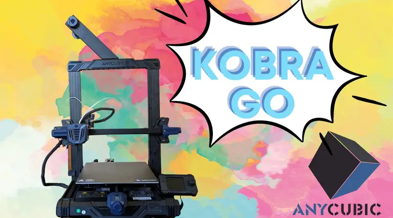
Anycubic’s Kobra Go is the latest in their Kobra series of FDM 3D printers. This is Anycubic&
3D Printing See all in this interest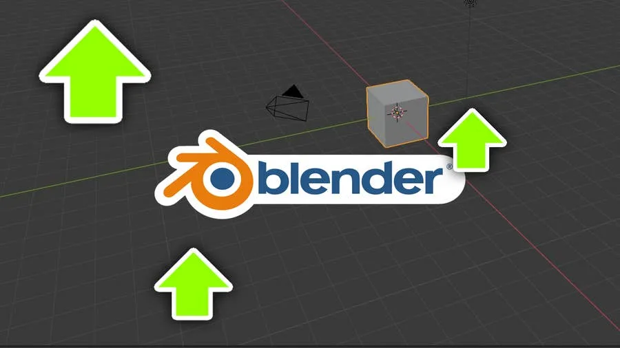
Blender is one of the most popular open-source 3D creation suites today. It doesn’t cost a dim
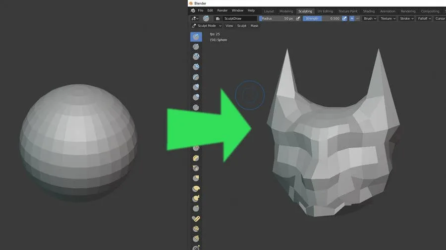
Blender has made a name for itself over the years as the go-to open source 3D modeling application.
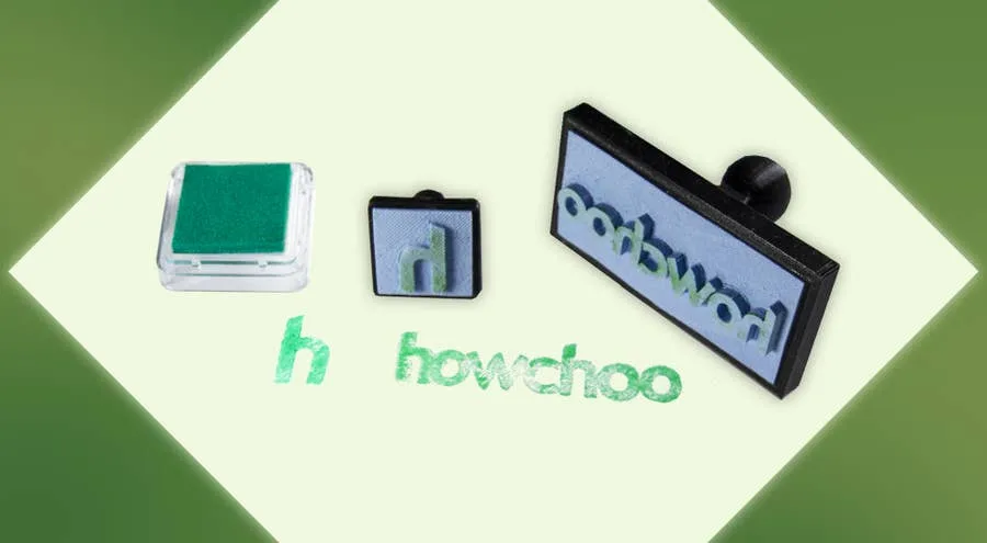
Let’s make some stamps! Why bother buying a pre-made design when you can create one yourself?
 Adobe See all in this interest
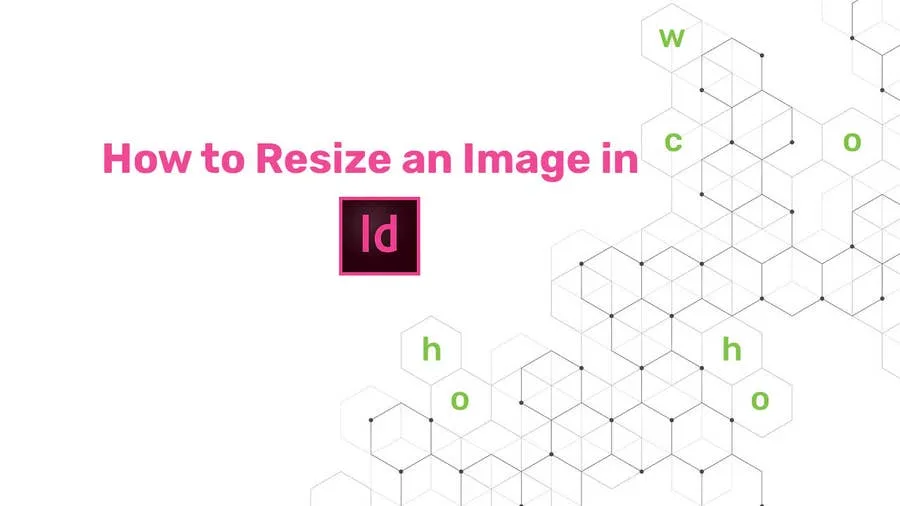
You might think that resizing an image would be as simple as dragging the corner of the frame. Well,
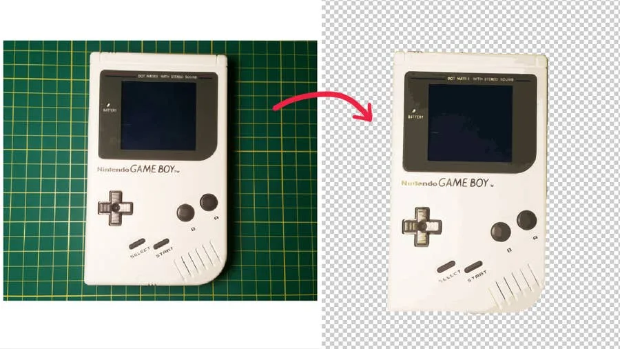
Adobe Illustrator has a few tools available that allow users to remove the background from their wor
InDesign uses “picas” as its default measurement for new documents. Many graphic designe
 Amazon See all in this interest
So Amazon just announced free same-day delivery in 14 different metro areas. How do you know if you

Wedding planning can be stressful, but for many, creating the registry is actually fun. After all, i
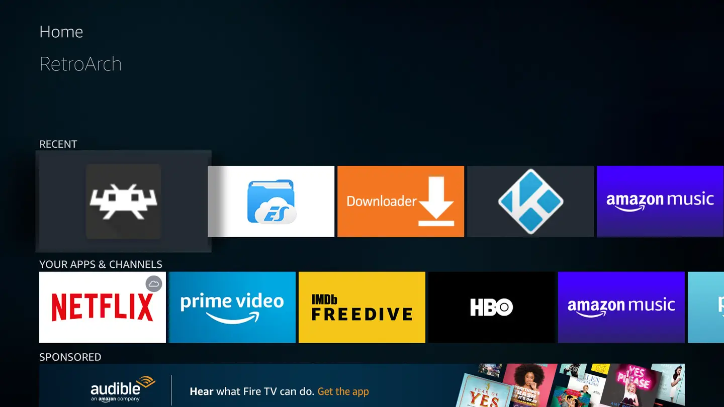
If you want to emulate all your favorite retro gaming systems quickly and easily, this guide is for
America See all in this interest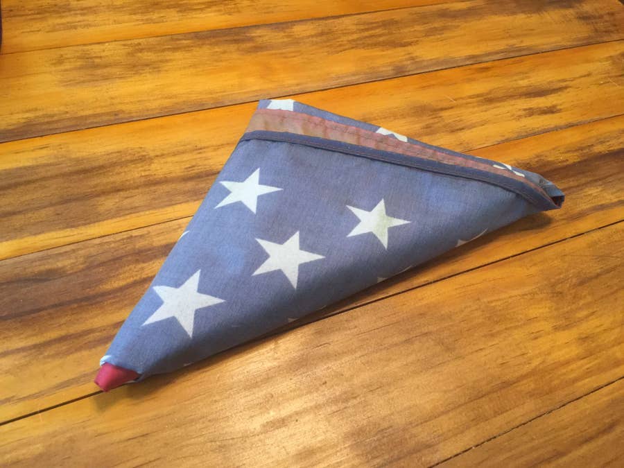
Since our country was conceived, the U.S. Flag has been a symbol of our country’s freedom. Our