
When learning object oriented programming in Python, there can be a few gotchas when it comes to dis
I have been programming for a while and have only recently begun to implement testing into my develo
Since the Raspberry Pi 4 was released, many have noticed that it can get pretty hot, espec
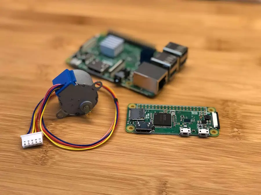
Controlling DC motors from your Raspberry Pi is quite easy! Whether you want to control a single mot
Today, I stumbled upon a use case where I needed to have a querysets that had objects from different
Learn how to use Python’s sleep function to make a timed delay. tl;dr 1 – Import the tim
In Python, range is an immutable sequence type, meaning it’s a class that generates
This guide will cover the basics of how to use three common regex functions in Python – findal
By default, Django migrations are run only once. But sometimes we need to rerun a Django migration,
It’s good to know what version of Python you’re running. Sometimes you may need a specif
The Python standard library includes a great set of modules, but many projects will require the use
This guide will show you how to validate yaml on the command line using Python. 1 – Use the ya